
In the world of iconic corporate logos, few are as instantly recognizable as the Apple logo. The silhouette of an apple with one bite has become a symbol of innovation, design and technological prowess. But how did this simple but powerful image become the symbol of one of the most influential companies in the world?
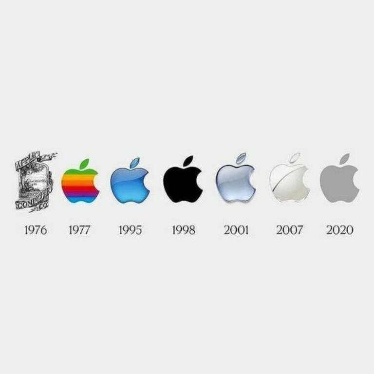
History of Apple Inc. begins in 1976, when Steve Jobs, Steve Wozniak and Ronald Wayne founded the company in a garage in Cupertino, California. The original Apple logo designed by Ronald Wayne was very different from the one we know today. It depicted Sir Isaac Newton sitting under an apple tree. This illustration was inspired by Newton's famous encounter with a falling apple, the event that led to his theory of gravity. The logo was complex and detailed, but it didn't match the company's image of simplicity and innovation.

Apple logo, 1976
In 1977, Rob Janoff, a graphic designer, was hired to create a new logo for Apple. He simplified the shape of the apple by removing shading details and adding horizontal iridescent stripes. The colors of the rainbow were chosen to highlight the company's ability to display color on its Apple II computer, one of the first computers to do so. This logo, known as the Rainbow Apple, became synonymous with Apple's early years and is still fondly remembered by many of the company's employees.

Apple logo, 1977
Along with the development of the Apple company, its logo also changed. In 1998, with the introduction of the iMac, Apple made a significant change, switching to a monochrome logo. The color stripes have been replaced by a smooth, chrome-like apple with a bitten piece. This new logo was more modern and in line with Apple's evolving design philosophy with a focus on simplicity and elegance.
The decision to remove the rainbow colors from the logo was also a practical one. Apple was shifting its product line toward a sleek and minimalist iMac design that was available in a variety of bright colors. The monochrome logo allowed the company to maintain a clean, cohesive image across all of its products.

Monochrome Apple logo, 1998
In 2001, Apple opened its first retail store in Tysons Corner, Virginia. This marked a new era for the company as it sought to redefine the retail experience for consumers. The Apple Store needed its own distinctive logo, so Apple introduced the Glass Apple. This logo featured a simple transparent apple with a bitten piece on a white background. It embodied the idea of transparency and accessibility, inviting customers into the world of innovation and design.

Today, the Apple logo has changed again. In 2013, Apple introduced a flatter, more minimalistic logo to coincide with the release of iOS 7. The new logo, often referred to as the "flat apple," is a sleek monochrome design without any shadows or dimensions. It reflects Apple's commitment to simplicity, clean lines and modern aesthetics.
The Apple logo is more than just a symbol; it's a reflection of Apple's journey from a startup in a garage to one of the most valuable and influential companies in the world. Each iteration of the logo reflects the company's changing style, design philosophy and technological progress.
Source: apple.com
